Color is more than just a visual experience—it’s a psychological tool that influences perception, emotion, and behavior. From legendary designers to scientific research, color psychology has shaped the way brands, artists, and cultures communicate. But how does it actually work?
What Experts Say About Color in Design
Some of the greatest minds in design have emphasized the power of color:
Johannes Itten: The Art of Color
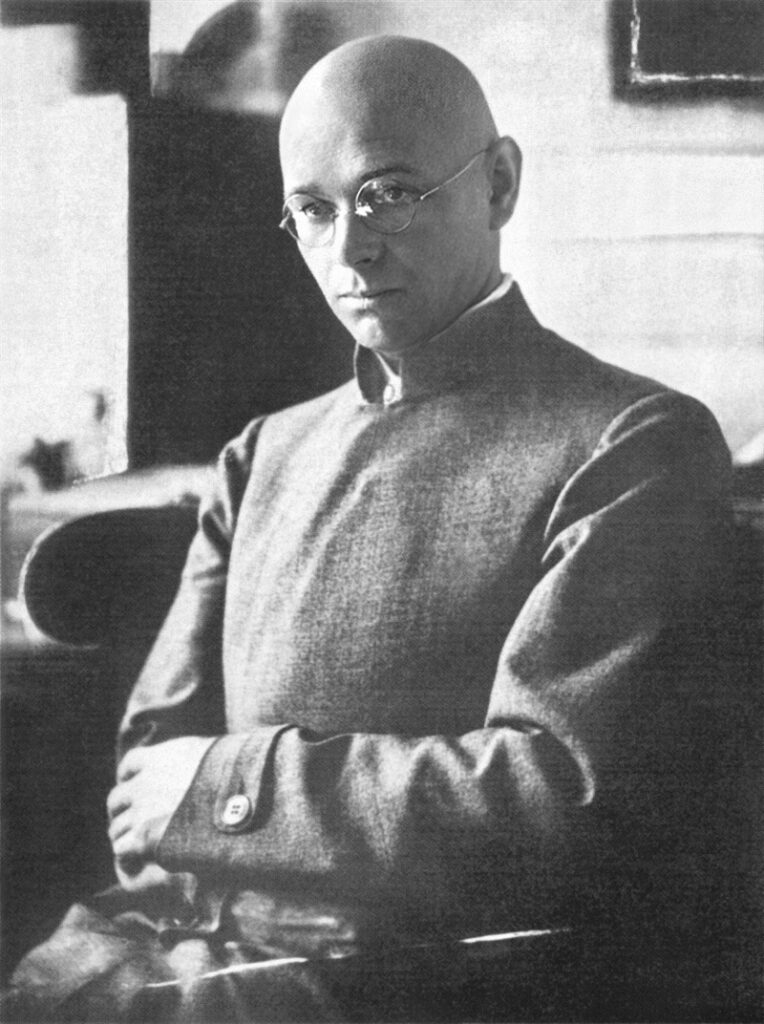
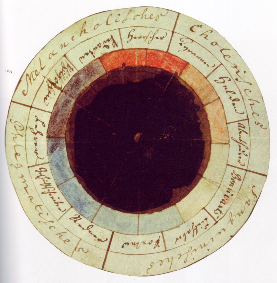
Johannes Itten, a Swiss painter and theorist from the Bauhaus school, wrote The Art of Color (1961), where he explored the emotional and symbolic meanings of colors. Itten developed a color star, which remains a foundational guide for designers and artists today.


Photograph: Paula Stockmar (as mentioned at https://bauhaus.daserste.de/credits) Derivative work:MagentaGreen – This file was derived from: Itten001.jpg:
Josef Albers: Interaction of Color
Josef Albers’ seminal book, Interaction of Color (1963), focused on how colors interact with each other. His research showed that the perception of a color is influenced by its surroundings—a crucial concept for branding and product design.

Leatrice Eiseman: Pantone’s Color Expert
Leatrice Eiseman, a color consultant and executive director of the Pantone Color Institute, wrote The Complete Color Harmony (2017). She describes how color choices affect emotions and branding, emphasizing the importance of color consistency in marketing.
The Science of Color Psychology
Psychologists have long studied how colors influence human behavior. Some key findings include:
- Red increases heart rate and energy – It’s associated with urgency (why sales signs are often red) and passion.
- Blue promotes trust and calmness – Used by financial institutions and tech companies (Facebook, Twitter, PayPal).
- Yellow stimulates creativity and optimism – Seen in brands like McDonald’s and IKEA.
- Green signifies growth and nature – Often used in eco-friendly brands and wellness industries.
- Black conveys luxury and sophistication – A favorite in high-end fashion (Chanel, Gucci, Prada).
A study by Elliot & Maier (2014) titled Color Psychology: Effects of Perceiving Color on Psychological Functioning in Humans found that color can affect cognitive performance, mood, and even purchasing decisions.

Cultural Meanings of Colors Around the World
Color meanings are not universal. What’s joyful in one culture might be mournful in another:
- White: In Western cultures, it symbolizes purity and weddings. In many Asian cultures (China, India, Japan), it represents mourning and funerals.
- Red: A color of passion and danger in the West; in China, it’s the color of luck and prosperity.
- Blue: Seen as calming and reliable in most Western cultures but represents mourning in Iran and Turkey.
- Green: A symbol of luck and nature in Western societies, but in some South American countries, it can be associated with death.
- Purple: Royal and luxurious in many Western cultures, but in Brazil and Thailand, it is linked to mourning.
Understanding these cultural nuances is crucial for global branding and marketing strategies.
Color Pairing & Harmony in Design
Effective color pairing enhances a design’s impact. Here are some classic color schemes:
1. Complementary Colors (Opposites on the Color Wheel)
- Example: Blue and orange (common in movie posters for strong contrast and balance)
- Effect: High contrast, energetic, and eye-catching
2. Analogous Colors (Next to Each Other on the Color Wheel)
- Example: Blue, teal, and green
- Effect: Harmonious, natural, and easy on the eyes
3. Triadic Colors (Evenly Spaced on the Color Wheel)
- Example: Red, yellow, and blue
- Effect: Vibrant, dynamic, and balanced
4. Monochromatic Colors (Different Shades of the Same Color)
- Example: Light blue, royal blue, navy blue
- Effect: Elegant, minimalist, and cohesive
Conclusion: Why Color Matters in Design
Whether you’re designing a brand identity, a website, or an advertisement, color choices have a profound psychological and emotional impact. By leveraging insights from designers, psychologists, and cultural studies, you can make intentional color decisions that resonate with your audience.
The next time you pick a color for a project, remember—it’s not just about aesthetics. It’s about communication, psychology, and culture all woven into a single hue.
